
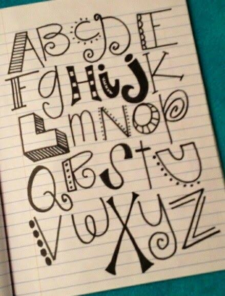
Lettering can turn a simple card, poster, or craft project into something personal and eye-catching. For beginners, bubble letter styles are a great place to start because they use soft shapes, thick outlines, and simple forms that are easy to draw. You do not need expensive tools or advanced drawing skills. With a pencil, marker, ruler, and a little practice, you can create lettering that looks neat, fun, and creative.
Why Lettering Is Great for Beginners
Hand lettering is different from normal handwriting because you design each letter instead of simply writing it. You can control the size, shape, spacing, outline, and decoration of every word.
Beginners often enjoy lettering because small changes can make a big visual difference. A basic word can look playful with rounded letters, elegant with thin lines, or bold with thick block shapes. This makes lettering useful for birthday cards, classroom posters, scrapbooks, gift tags, signs, and home crafts.
Bubble Letters for Fun Designs
Bubble letters are one of the easiest lettering styles to learn. Each letter looks rounded, thick, and slightly inflated. The style works especially well for children’s crafts, party posters, colorful cards, and playful signs.
Start by writing a normal letter lightly with a pencil. Draw a rounded outline around it while leaving enough space between the original line and the outer shape. Erase the guide letter after finishing the outline.
You can leave the letters plain or add patterns inside them. Dots, stars, stripes, hearts, and small shapes can make bubble lettering more interesting without making it difficult.
Simple Block Lettering
Block letters use straight lines, clear edges, and strong shapes. They are perfect for posters because people can read them easily from a distance.
Beginners can create block letters by first writing large capital letters. Add parallel lines around each stroke to make the letters thicker. Keep the width of each letter similar so the finished design looks balanced.
A ruler can help when creating straight lines. However, slightly uneven lines can also give handmade projects a relaxed and creative appearance.
Shadow Lettering for More Depth
Adding shadows is one of the easiest ways to make simple letters look more professional. You can use shadows with bubble letters, block letters, or normal handwriting.
Choose one direction for the shadow, such as the lower right side. Draw a second line beside the original letter edges in the same direction. Keeping every shadow consistent creates the feeling that the letters are standing above the paper.
You can fill shadows with pencil, marker, or patterns. Even a small shadow can make a poster title look much stronger.
Faux Calligraphy for Cards
Traditional calligraphy often requires special pens and controlled hand movements. Faux calligraphy gives beginners a similar look with normal pens or markers.
Write a word in cursive handwriting first. Look at the parts of each letter where your hand moves downward. Add another line beside those downward strokes and fill the space between them.
This creates thick and thin areas that copy the appearance of brush lettering. Faux calligraphy works beautifully on greeting cards, wedding crafts, invitations, and handmade gift tags.
Decorative Outline Letters
Outline lettering is another simple style that allows plenty of creativity. Instead of filling the letters completely, you leave the center empty and decorate the outline.
You can use double outlines, dotted borders, dashed lines, or small decorative shapes. Another idea is to fill the empty space with flowers, leaves, stars, or geometric patterns.
This technique is useful when you want large letters without using too much ink or marker color.
Mixing Different Lettering Styles
Using more than one lettering style can make a project more interesting. For example, a poster title could use large bubble letters while smaller information appears in clean block lettering.
A handmade card could combine faux calligraphy for the main message with small uppercase letters underneath. The key is to avoid using too many styles at once.
Two lettering styles are usually enough for beginner projects. One style can attract attention while the second style supports the main design.
Choosing Colors for Lettering Projects
Color can change the mood of your lettering. Bright shades work well for birthday cards and children’s crafts, while soft colors can create a calm and elegant appearance.
Try choosing two or three main colors before starting. Using a limited color group keeps the project organized and prevents the design from becoming too busy.
You can also use one dark color for outlines and lighter colors inside the letters. This creates contrast and makes the words easier to read.
Practice Letter Spacing
Good spacing is just as important as the shape of the letters. Letters that sit too close together may be hard to read, while letters that are too far apart can make words look disconnected.
Draw light pencil guidelines before adding permanent marker. These guides help keep letters at a similar height and maintain even spacing.
Practice writing the same word several times. Compare each version and notice where the spacing looks most natural. Regular practice will quickly improve your control.
Add Small Decorations Around Words
You do not have to decorate every letter. Sometimes small drawings around a word can make the entire design feel complete.
Stars, hearts, leaves, arrows, clouds, dots, and simple lines are easy additions. Use them to fill empty spaces around headings without covering the letters.
For themed crafts, match the decorations to the occasion. Balloons and confetti work for birthdays, while flowers and leaves are suitable for spring cards and handmade gifts.
Start Simple and Develop Your Own Style
Beginners often try to make every letter perfect, but handmade lettering does not need perfect lines. Small differences between letters can give a craft more personality and charm. Focus first on clear shapes, comfortable spacing, and consistent outlines.
As you practice, experiment with rounded letters, shadows, patterns, and different pen sizes. You can also study examples from bubble-letters.net in the middle of your creative practice to discover new approaches and shapes. Over time, combining simple techniques will help you develop a lettering style that works naturally for cards, posters, scrapbooks, and many other craft projects.